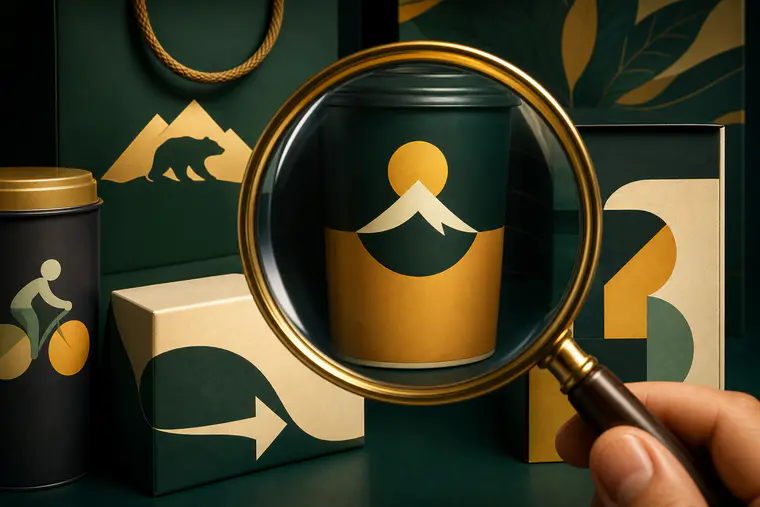
Why brands hide tiny details in plain sight
If you’ve ever felt a little spark of delight after spotting a hidden arrow, number, or character in a logo, you’ve experienced exactly what many designers aim for. Small, thoughtful details make a mark easier to remember, hint at a brand’s story without extra words, and reward careful observers. The short answer to “why do brands do this?” is simple: a well-placed Easter egg turns a static image into a mini conversation. By the end of this guide, you’ll be able to notice more of these details, explain them responsibly, and use them as smart trivia that actually holds up.
How hidden meanings actually work
Great marks compress a lot into a little. Designers lean on a few dependable techniques:
- Negative space: Shapes formed by the background—the “gap” that becomes an arrow or letter once you notice it.
- Dual imagery: One shape reads two ways (a glove and the letters inside it; a mountain and an animal silhouette within).
- Symbol substitution: A letter morphs into a relevant icon—a pin, a headphone, a wheel—without harming legibility.
- Local references: A city, landmark, or founding story sneaks into the design as a respectful nod to origins.
- Gentle wordplay: Numbers and letterforms carry historical facts (original store counts, flavor totals, founding years).
You don’t need special training to see these. You just need the right prompts, and a bit of patience.
A quick spotting guide you can use anywhere
When a logo catches your eye, try this 30‑second checklist:
- Look between letters: Do gaps create a symbol pointing somewhere or suggesting motion?
- Flip the figure/ground: What happens if you mentally “color in” the negative space?
- Scan for numbers: Could a numeral be hiding inside monograms or color blocking?
- Trace the brand’s hometown: Any hints of a local bridge, animal, or landmark?
- Ask what the product does: Could a tool, ingredient, or user action be snuck into a letter?
- Keep it cautious: If a claim sounds too neat, check the brand’s own materials or a reputable design breakdown before repeating it as fact.
Arrows, motion, and speed cues
FedEx: an arrow that appears when you relax your eyes
Between the “E” and the “x,” the negative space forms a crisp right‑pointing arrow. It’s simple and famously effective at implying speed and precision without shouting.
Tour de France: a cyclist hidden in the letters
The “our” in “Tour” sketches a rider: the “o” becomes a wheel and torso, the “r” suggests a person in motion, and the dot/yellow circle acts as a sun and a spinning wheel. Once seen, it’s impossible to unsee—and it captures the event’s energy.
Formula One (classic mark): the “1” in the fast lane
In the widely recognized earlier F1 logo, the number “1” appears in the negative space between the black “F” and the red speed lines. The device telegraphed velocity without extra graphics.
Smiles, friendliness, and human faces
Amazon: a smile that also says “A to Z”
The curved arrow beneath the wordmark doubles as a smile and points from the “a” to the “z,” quietly promising that you’ll find nearly anything you need.
Goodwill: a friendly face inside the “g”
Goodwill’s stylized “g” also reads as a smiling face, reinforcing the nonprofit’s people‑first mission and optimistic tone.
Beats by Dre: the “b” wearing headphones
The red circle can be read as a head in profile, with the lowercase “b” positioned like an earcup. It’s a tidy visual that communicates the product category instantly.
Numbers with stories baked in
Baskin‑Robbins: the original “31” flavors
Inside the pink‑and‑blue “BR,” the pink segments shape the number “31,” a nod to the brand’s famous “one flavor for every day of the month” idea from its early years.
Domino’s: three dots, three stores
The domino tile in the logo carries three dots—often explained as representing the company’s first three locations from its early expansion. It’s a compact bit of history you can spot at a glance.
Hometown nods and origin clues
Toblerone: a bear in the mountain
Look carefully at the mountain silhouette and you’ll find a standing bear formed by negative space. It salutes Bern, Switzerland—nicknamed the “City of Bears”—where the chocolate originated.
Cisco: digital signal meets San Francisco bridge
Cisco’s name traces to San Francisco, and the vertical bars above the wordmark evoke both a digital signal and the spans of the Golden Gate Bridge—a two‑in‑one metaphor that anchors the brand to place and purpose.
BMW: colors of Bavaria, not a spinning propeller
The blue‑and‑white roundel reflects the Bavarian state flag. Early advertising once depicted the emblem as a propeller, which seeded a lasting myth, but the origin lies in regional colors and company heritage.
Audi: four rings, four founders
The interlocking rings commemorate the Auto Union of four German automakers—Audi, DKW, Horch, and Wanderer—whose merger preceded the modern brand.
Wordmarks that double as pictures
Carrefour: a hidden “C” at the crossroads
“Carrefour” means “crossroads” in French, and the logo sets a red and a blue arrow in opposition. The negative space between them forms a white “C,” an elegant nod to both name and navigation.
Milwaukee Brewers (classic glove): a catch and two letters
Baseball fans cherish the 1970s glove logo where the fingers and palm shape the letters “m” and “b.” It’s a friendly reminder that sports identities can be clever without being fussy.
Hartford Whalers: tail, “W,” and an invisible “H”
Another sports gem layers meanings: a whale’s tail crowns a bold “W,” while the negative space between them creates a crisp “H.” Three ideas, one tidy mark.
Sun Microsystems: a rotational ambigram
The tiled diamond of “SUN” letterforms reads the same from multiple orientations. It’s a masterclass in symmetry and legibility for technology branding.
Product‑first transformations
VAIO: from analog wave to digital 1 and 0
The “VA” portion suggests an analog sine wave, while the “IO” resolves into the binary digits 1 and 0. The concept maps the company’s domain—converging analog and digital—straight into the logotype.
Pinterest: a letter that literally pins
Pinterest’s looping “P” echoes the shape of a pushpin, tying the act of “pinning” inspirations to a letter you see every time you open the app.
Icons with lore—and a few healthy clarifications
Apple: a bite for scale, not a secret tribute
There are romantic stories about the Apple symbol, including tributes and hidden meanings. The more grounded explanation from the original designer is that the “bite” helps distinguish the apple from similar fruit silhouettes and improves visual scale. It also conveniently plays on the word “byte,” but that pun wasn’t the driving brief.
Toyota: interlocking ovals with a clear brief
Toyota explains its mark as three ovals: two inner ovals representing the customer and the product, overlapping to form a stylized “T,” and a larger outer oval encircling them. Some observers enjoy mapping the strokes to the letters in “TOYOTA,” but the official meaning emphasizes relationship and reliability over puzzle‑solving.
Hershey’s Kisses: a sideways chocolate between letters
In many versions of the “HERSHEY’S KISSES” wordmark, the negative space between the “K” and the “I” can be read as a tilted chocolate “kiss.” It’s a fun find that design fans often point out, even if it rarely appears in formal brand explanations.
Starbucks: a twin‑tailed siren from old seafaring lore
The iconic figure comes from historical depictions of a siren. It fits the brand’s maritime inspiration and Seattle’s port heritage without resorting to hidden shapes.
NBC: a peacock facing forward
The colorful peacock—introduced decades ago to showcase color broadcasting—faces to the right, a detail commonly interpreted as looking to the future.
Using these details as better trivia
Hidden meanings make great conversation starters, but the best trivia is careful with claims.
- Lead with what’s documented. Many brands publish their logo stories; designers sometimes share process notes in reputable interviews or case studies.
- When a detail is widely observed but not official, frame it that way: “Fans often point out…” or “Some viewers notice…”.
- Avoid sensational add‑ons. If a claim sounds like a conspiracy or a marketing “hack,” it probably overshoots the intent.
- Tie the detail back to the brand’s promise: speed, friendliness, local pride, craftsmanship. That’s what makes the Easter egg feel earned, not gimmicky.
Why these micro‑stories stick in memory
- They lower cognitive load. One smart image that does two jobs (letter and symbol) is easier to store than two separate ideas.
- They reward curiosity. The little “aha!” becomes a personal discovery, which people naturally want to share.
- They travel well. A hidden arrow or city bear crosses language barriers—handy for global brands.
Try it: a mini spotting challenge
The next time you’re in a grocery aisle or scrolling apps, grab three logos and ask:
- What’s the loudest promise here—speed, selection, heritage, or friendliness?
- Where do edges meet? Check corners and letter joins for arrows, numerals, or familiar objects.
- What’s the brand’s hometown or origin story? Any local animal, flag colors, or landmarks?
Write down what you find, then look up the brand’s site or a trusted design reference to confirm. You’ll quickly learn which details are intentional, which are fan favorites, and which are just nice coincidences.
Responsible debunking without being a killjoy
Correcting a myth doesn’t have to ruin the fun. Try this structure:
- Acknowledge the delight: “The propeller story is catchy.”
- Share the grounded version: “But the BMW roundel traces to Bavaria’s flag colors.”
- Offer a takeaway: “Either way, the mark connects motion with heritage, which explains its staying power.”
This way, you keep the social spark while giving your friends a truer—and more interesting—story.
The strong takeaway
Tiny details aren’t magic tricks; they’re craftsmanship. Whether it’s an arrow hidden between letters, a number tucked into color blocks, or a hometown landmark encoded in lines, these choices make brands easier to remember and more satisfying to talk about. Learn to spot them, describe them honestly, and you’ll turn casual logo chatter into trivia that teaches something real.
Frequently Asked Questions
Are the hidden meanings in logos always intentional?
Not always. Many are deliberately designed, especially negative‑space arrows, numerals, or local nods documented by the brand. Others are fan observations that the company hasn’t confirmed. When in doubt, present them as possibilities, not facts.
How can I verify whether a logo’s “secret” is real?
Start with the brand’s own materials or a reputable design case study. Company press kits, brand guidelines, and interviews with the logo’s designer are the best sources. Avoid repeating claims that lack a clear origin.
Do all good logos hide something?
No. A strong mark can be completely straightforward. Hidden layers help when they clarify a promise (speed, selection, heritage) without hurting legibility. If the “secret” complicates the read, it’s usually not worth it.
Is this the same as subliminal advertising?
Not really. Subliminal claims suggest below‑conscious influence; modern identity work focuses on clarity, distinctiveness, and memorable storytelling. The best “hidden” elements function in plain sight once you notice them, which is part of the fun.
Approved member comments will appear here.