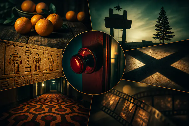
If you love movies but suspect you’re missing the fun little touches directors hide in plain sight, you’re in the right place. This guide spotlights 15 small, on-screen details—intentional props, color cues, background cameos, and blink-and-you-miss-it moments—that reward a rewatch and can give you an edge at your next trivia night. No conspiracy theories or flimsy rumors here—just details that are visible on screen and widely recognized by film lovers.
Note: Light spoilers ahead, mostly for context.
1) Raiders of the Lost Ark (1981): Droid Hieroglyphs in the Well of Souls
In the Well of Souls scene, the hieroglyphs on the walls include tiny carvings of two very famous droids. It’s a playful nod from director Steven Spielberg to his friend George Lucas.
- What to look for: During shots of the chamber walls, scan for small carvings that resemble a short, barrel-shaped droid next to a tall, gold humanoid one.
- Why it matters: It’s a cross-franchise wink that helped popularize the modern idea of “Easter eggs” in blockbusters.
Trivia tip
If a quiz asks about Star Wars characters appearing in a non–Star Wars film, this is a classic answer.
2) Star Wars: A New Hope (1977): The Head-Bumping Stormtrooper
As a squad barges through a Death Star doorway, one stormtrooper smacks his helmet on the low frame. The goof remained in releases and has become part of the film’s charm.
- What to look for: The first wave of troopers entering a control room—watch the one at the back.
- Why it matters: It humanizes the mythic scale of Star Wars and reminds viewers that movie magic includes happy accidents.
3) Fight Club (1999): Tyler’s One-Frame Cameos
Before the character is formally introduced, he appears for a single frame in various scenes. Director David Fincher used this to visualize the narrator’s fractured mental state.
- What to look for: Brief, flickering silhouettes of a man in the background or near the edge of the frame, long before the two “meet.”
- Why it matters: It’s a practical demonstration of how editing can plant ideas in a viewer’s subconscious.
4) The Godfather (1972): Oranges as Omen
Oranges repeatedly show up near scenes of impending violence. The fruit’s color and placement become a quiet forecast of danger.
- What to look for: Bowls of oranges on tables, characters handling the fruit, or bright orange tones in costuming and props before pivotal moments.
- Why it matters: It’s a visual motif—simple, repeatable, and effective in foreshadowing.
5) Psycho (1960): The Color of Marion’s Bra
Early on, Marion wears white undergarments; after her pivotal decision, she’s seen in black. Alfred Hitchcock used wardrobe to mirror moral descent.
- What to look for: The motel-room scenes—contrast the light, “innocent” palette with the later, darker choice.
- Why it matters: Costume design can track character psychology without a line of dialogue.
6) Back to the Future (1985): From Twin Pines to Lone Pine Mall
After an incident in 1955 involving a fence and a certain tree, the present-day mall’s sign quietly changes to reflect the altered timeline.
- What to look for: Compare the mall sign at the start and near the end; count the pine trees.
- Why it matters: It’s a precise, visual payoff that makes time-travel consequences feel tactile and local.
7) The Shawshank Redemption (1994): “Exodus” and the Rock Hammer
A Bible with a cut-out hides a rock hammer. When the secret is revealed, the page visible is from the Book of Exodus—a wry nod to escape.
- What to look for: The hollowed Bible and the word “Exodus” visible at the reveal.
- Why it matters: It’s a thematically tidy detail that rewards viewers who notice text on props.
8) The Departed (2006): X Marks a Death
Throughout the film, X shapes appear around characters fated to die—formed by scaffolding, floor tiles, and lighting.
- What to look for: Overhead shots with crisscrossing beams, taped patterns on windows, or X-shaped shadows.
- Why it matters: Production design and blocking can embed foreshadowing into the frame itself.
9) The Sixth Sense (1999): Red Means a Spirit Is Near
Director M. Night Shyamalan used red as a controlled accent whenever the spirit world brushes against the living.
- What to look for: Red doorknobs, clothing, balloons, or small set dressings during supernatural beats.
- Why it matters: Color theory becomes a narrative compass—once you see it, you can’t unsee it.
10) The Exorcist (1973): Subliminal Flashes of a Demon’s Face
Across dream and night sequences, a white-painted face with bared teeth appears for mere frames. It’s not a jumpscare so much as a lingering unease.
- What to look for: Rapid flashes in the kitchen scene and in nightmare montages.
- Why it matters: It shows how even a fraction of a second can shape an audience’s emotional state.
11) Toy Story (1995): The Shining’s Carpet Pattern in Sid’s House
The hexagonal orange-brown carpet in the villainous kid’s hallway mirrors the Overlook Hotel’s pattern from The Shining—an homage filtered through animation.
- What to look for: Overhead or long hallway shots in Sid’s home; study the rug.
- Why it matters: Pixar’s deep-cut references reward cinephiles and connect animation to film history.
12) Pixar’s “A113”: The Classroom That Pops Up Everywhere
A113 is a recurring code in many Pixar and other animation-adjacent films, named after a classroom used by student animators.
- What to look for: License plates, room numbers, serial codes—often “A113” tucked in plain sight.
- Why it matters: It’s a community in-joke that also trains you to scan corners of the frame.
13) Spider-Man: Into the Spider-Verse (2018): The “Bagel!” Sound Effect
When Miles and Peter flee Alchemax, a tossed bagel hits a scientist. Instead of “pow,” the on-screen comic text simply reads “bagel!”
- What to look for: The cafeteria escape; pause as the pastry connects.
- Why it matters: It’s a perfect marriage of visual humor and the film’s comic-book typography.
14) E.T. the Extra-Terrestrial (1982) and Star Wars: The Phantom Menace (1999): A Two-Way Nod
On Halloween in E.T., our visitor waddles toward a Yoda costume and coos with recognition. Years later, a pod of E.T.’s species appears in a Galactic Senate shot.
- What to look for: In E.T., the trick-or-treat sequence; in The Phantom Menace, scan senate platforms for small, long-necked aliens.
- Why it matters: It’s a gentle cross-franchise handshake between two of the most influential sci-fi universes.
15) The Dark Knight (2008): The Nurse’s Name Tag
During the hospital sequence, the Joker’s nurse disguise sports a name badge that reads “Matilda”—the name of Heath Ledger’s daughter.
- What to look for: Medium shots of the Joker in the nurse uniform; glance at the chest badge.
- Why it matters: It’s a human-scale touch tucked inside a massive superhero epic.
Why These Tiny Details Work (and How to Start Spotting More)
A pattern emerges: filmmakers use small, repeatable choices—colors, props, background typography, or set geometry—to add meaning without stopping the story. You can train your eye to notice them.
- Pause on establishing shots. Production designers often place hints there because the frame holds longer.
- Track color accents. If one hue keeps recurring around a character or location, it’s probably intentional.
- Rewatch key scenes with the sound low. Visual motifs pop when you remove dialogue as a distraction.
- Look to corners and signage. Room numbers, license plates, receipts, tickets, and mall signs are favorite hiding spots.
- Expect echoes after big moments. If a movie builds a motif (like oranges or red objects), check the scenes right before turning points.
How to Use This Knowledge (Beyond Trivia)
- Deepen your appreciation. When you catch a motif—like the X’s in The Departed—you’re seeing the design beneath the drama.
- Discuss with friends without spoilers. Point out the device (“Watch the color red”) rather than the payoff.
- Choose smarter rewatch priorities. Films heavy on design—Pixar titles, Hitchcock, Fincher, Kubrick-influenced works—tend to be rich in deliberate background details.
- Build your own watchlist. If you enjoyed one entry here, pair it with a related stylistic cousin (e.g., The Sixth Sense with other color-coded thrillers).
A Few More You Might Notice Next Time
- The “impossible” hallways and shifting props in The Shining intentionally keep viewers unsettled.
- In many Coen Brothers films, background store names and signage offer dry jokes you only catch on a second pass.
- In Christopher Nolan’s films, watch for pocket objects (spinning tops, rings, mementos) that double as theme statements.
These aren’t mistakes to nitpick; they’re brushstrokes. The joy is noticing how they quietly guide your feelings long before your brain puts words to it.
Frequently Asked Questions
Are these details always intentional?
Often, yes—especially color motifs, prop text, and designed patterns. Sometimes happy accidents (like a stormtrooper bump) stick around and take on meaning after the fact. Either way, if it enhances the experience, it’s worth appreciating.
Do I need to pause and screen-grab to catch them?
Not necessarily. A calm rewatch with attentive eyes will surface many. Pausing helps with text (license plates, signs), but color cues and patterns usually register even at normal speed once you know to look.
Are all “movie Easter eggs” real, or are some internet myths?
Some are myths or misreadings. A good rule: if a detail requires elaborate explanation or contradicts what you can plainly see on screen, be skeptical. Focus on items you can verify by watching.
What’s the best way to discover more on my own?
Choose one element to track—say, a single color or a recurring prop—and follow it scene to scene. Then compare notes with a friend on a rewatch. You’ll often find the same breadcrumb trail leading you to the film’s themes.
Approved member comments will appear here.